University Logo
Our logo is one of our most valuable assets. It provides brand recognition and represents our University inside and outside our community. To ensure that the Belmont brand is consistent, recognizable and professional, please adhere to our guidelines regarding the logo.
Full Color Logos
Full Color Primary Logo
This is the primary, full color, default version of the logo should only be used on white, neutral or light sky-blue backgrounds.
Full Color Horizontal Logo
This version of the logo can be used in settings where the vertical version is not appropriate or does not fit the space available.
Color Variations


Usage Guidelines
In order to maintain legibility and clarity, the logo should never be reproduced smaller than the sizes outlined here. The minimum inch size applies to physical communications and the pixel minimum applies to digital communications.
Vertical Logo: .75” wide; 54 pixels
Horizontal Logo: 1.5” wide; 108 pixels
A clearance area or margin around the logo is needed to ensure the logo is never encroached upon by surrounding content.
As illustrated, to determine the minimum clearance area, use the measurement of the width of the “T” in “Belmont” around all four sides of the logo. This always scales with the logo. When possible, allow additional clearance.
To print correctly, high-resolution graphics must be at least 300 ppi (pixels per inch) at the actual size at which they will appear. On-screen resolution for Web, email and presentations is much lower, and the logo should be at least 72 ppi at the actual size it will appear on screen.
Incorrect Usage
Here are a few examples of logo treatments that break the brand standards and do not represent the University effectively. The logo should never be stretched out of scale, recolored, redrawn, have additional typefaces or text added, be broken into separate pieces, be trimmed, or be used to create a different logo.
Don't alter the color of the logo
Don't use more than one color
Don't rearrange the elements of the logo
Don't fill portions of the logo with different colors
Don't skew or stretch the logo
Don't apply drop shadow, glow or any other effects to the logo
Don't attempt to edit/create a new version of the logo or use any non-approved type faces
Don't use the tower icon alone
Logo Downloads
Download official University logo package for use in print and digital items. Please note that using the correct logo file type is important to ensure the clarity, sharpness and consistency of the Belmont logo.
- PNG: Digital images with transparency, ideal for web use (e.g., logos on colored backgrounds). Not recommended for print. Cannot be scaled up without losing quality.
- EPS: Scalable vector-based files with transparent backgrounds, perfect for print materials of any size (from business cards to billboards).
- JPG/JPEG: Digital images without transparency, best for photographs. Suitable for web and print use. Cannot be scaled up without losing quality.
- Both PNG and JPG files must be created at the correct size and resolution for their intended use and can be opened with any computer software.
University Seal
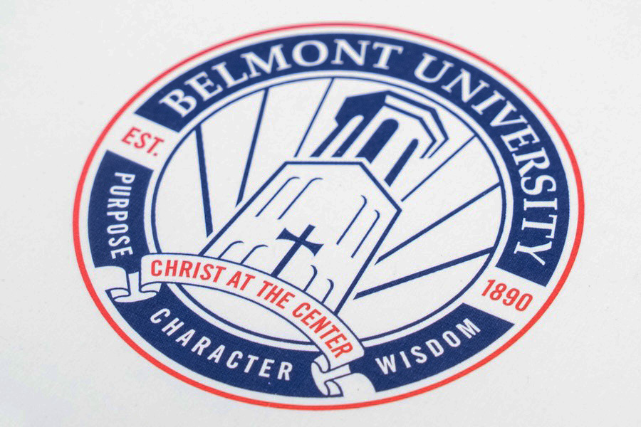 The University seal serves as the Institution's official emblem, typically reserved for formal and official purposes. In contrast, the logo functions as the University's primary visual identity, used for general branding and public-facing communications. Use of the University seal is restricted to the following:
- Communications from the Office of the President, the Board of Trustees and executive officers of the University for special communications and events.
- Formal documents including commencement programs, diplomas, transcripts, certificates and contracts.
- Other official documents or historical University materials.
The seal does not provide the visual recognition offered by the logo and should not be used interchangeably with the logo. The seal should not be used in daily communications or altered in any way.
To request the official University Seal package, email marketing@belmont.edu.
Retired Assets
Belmont’s visual identity is ever evolving to remain contemporary, fresh and relatable. Because of this, sometimes it requires retiring outdated assets. Please note the retired assets on this page and refrain from using them.



University Logo Policy
The Belmont University official logo features the Bell Tower icon with “Belmont University” underneath. Each college has a specific version of the official logo that includes their name. Departments and units can request creation of a logo "lockup" here.
Belmont is a collection of endorsed brands. This means that the parent brand is Belmont University and a variety of sub-brands exist and live under this umbrella. While some of these sub-brands may operate independently and with their own art marks at the forefront to their constituent base, they still reflect upward to the parent brand.
A great example is the “Let Hope Abound” mark. It should not be used to replace the Belmont logo, but instead, as a complement. It can appear as the leading element — however, the Belmont logo would take a secondary focus, yet still maintain presence.
An identity mark may be authorized for creation by University Marketing and Communications (UMAC) if the entity requesting it is primarily focused on external audiences. This is reserved in rare cases for Presidential-level initiatives or strategic priorities.
Many times a department may need promotional and communications help that does not involve the need for a new identity mark. UMAC may recommend a brand look or design elements rather than a logo or mark if that best accomplishes the goal. In some cases, UMAC may suggest that internal units create their own branding. The UMAC team maintains a premium Canva license (design software) for these purposes. For more information about Canva, email marketing@belmont.edu.


